Perched on top of a long, spindly stem, an opium poppy’s gnarled outer leaves clutch a dozen babies’ heads in place of its poisonous seeds. Appearing in The New York Times Op-Ed section, July 1975, the illustration bisected the contrasting headlines of two short editorials, one printed above the other: “The Poppy Whose Sap Is Anti-Life” and “Drugs Whose Flowers Are Life”. The precarious cradle, its cruel decay channeling the 16th century Vanitas still life, works in uncanny graphic opposition to the cherubic faces that meet our gaze. Text and image tender a striking relationship here—independent but complementary, autonomous yet somehow symbiotic. And that is exactly what Brad Holland is banking on.
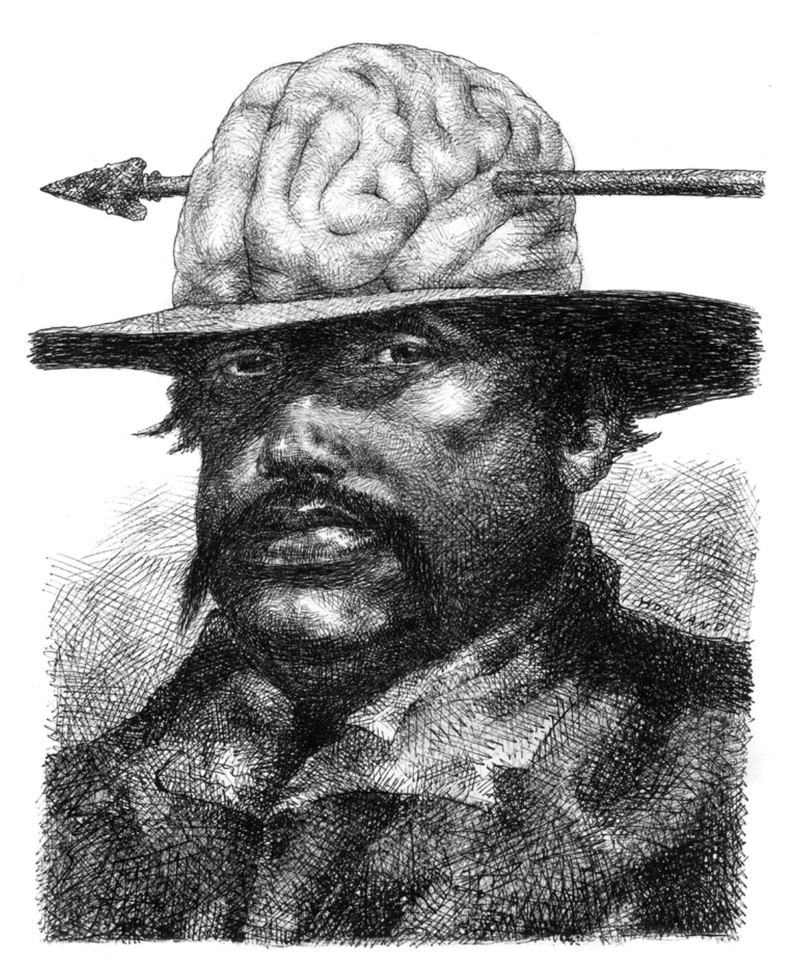
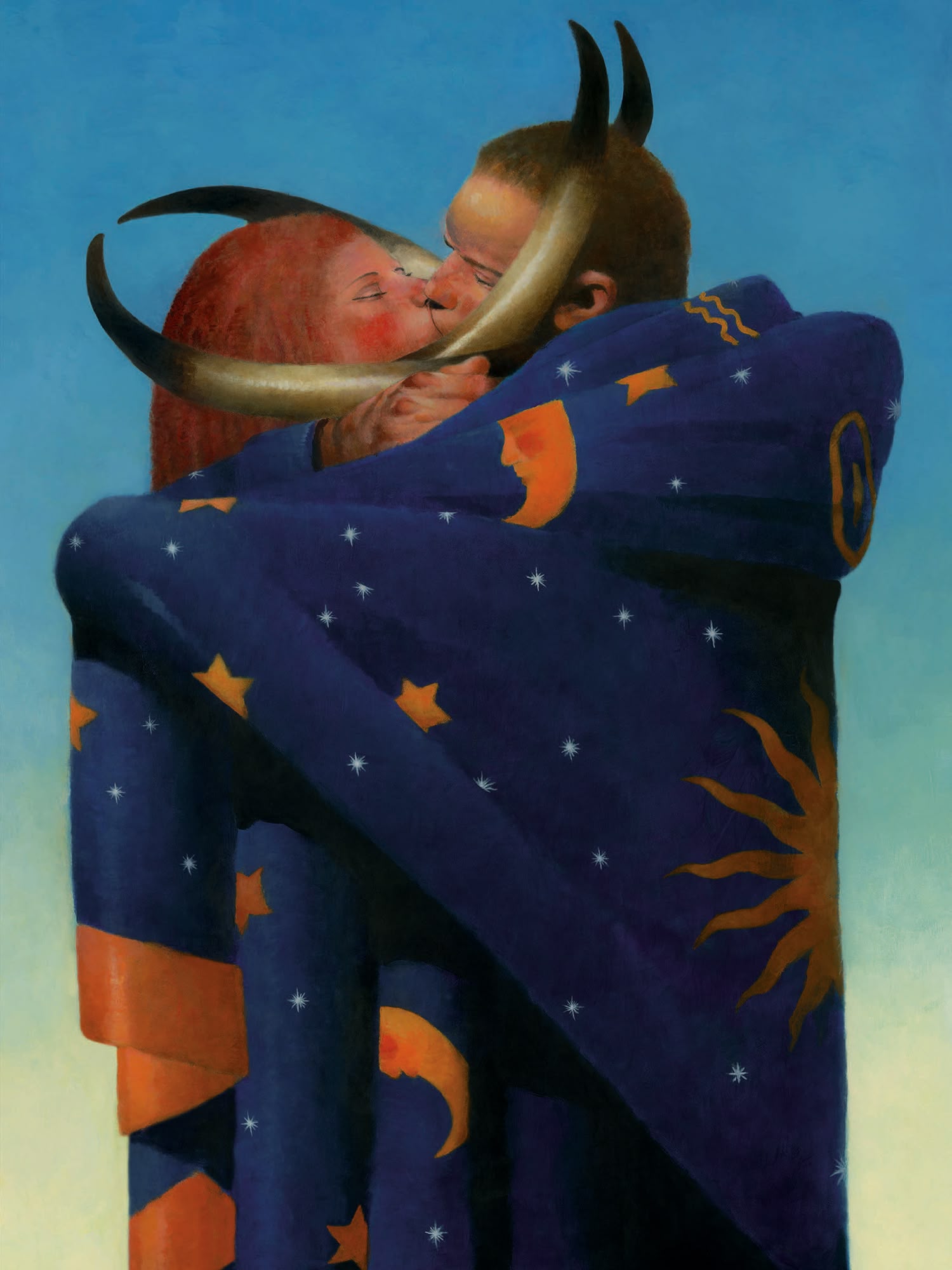
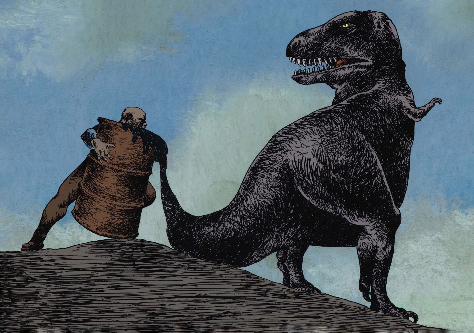
A veteran artist and illustrator now sixty-years in the game, Holland is likely best known for his enigmatic synthesis of concept and narrative in a single expressive image—a picture that suggests the rich underpinnings of an article’s idea without abandoning its own story. At a time when illustrations were not autonomous—with their own drives and desires—but rather facsimiles of the texts they accompanied, Holland was more than an outlier. He was a pioneer who held staunch opposition to rendering the ideas of editorial committees and art directors alike—the artist insisted on his own instinct. Expunging the arcane conventions of narrative illustration was a heavy lift for a young man of 24, but Holland would persist in bending the industry to his shape until the niche he built for himself became illustration proper. Boasting a long list of high-profile clients, including Time, The New York Times, Vanity Fair, and The Wall Street Journal, Holland’s evocative artwork has also graced the covers of literary classics penned by Henry David Thoreau, Oscar Wilde, and Robertson Davies. Working with a sensitive hand across a spectrum of mediums—pen and ink, watercolor, gouache, acrylic—the artist’s graphic commentary is skillfully cut with allusion and metaphor, provoking a host of curious associations. Perhaps they are imperfectly remembered configurations from Holland’s panoramic memory, given tangible form when translated into his unmistakable visual language.
Born in the American Midwest town of Fremont, Ohio in 1943, Bradford Holland’s childhood was both spare and rich. His family’s apartment—the upper floor of a frame house—hosted few creature comforts, a condition magnified by wartime austerity. Brad was a painfully shy autodidact, able to read by age four with a knack for drawing comic strips on the backs of his parent’s used greeting cards. Fridays included a ritual hike to Falquette’s, the local soda fountain, where the young boy and his father would collect Look, LIFE, and Colliers, the latter to be brought home and relished for the cartoons inside. As the family owned neither books nor a television, Holland found a window beyond the town’s forested borders in his German grandmother’s storybooks: Old World myths and fables, witch-lore and folktales as dark and solid as the black linework for which the artist would become known. Though fantastical personages wouldn’t surface in his artwork for at least another decade, it is plausible that his grandmother and her library were the sluice to a kind of magical realism and the thinking that it inspires.
Holland did not want to go to college—in fact, he was the only one of four brothers to resist the expectation—and a career in illustration wasn’t yet among his aspirations. He wanted to work for Walt Disney making movies and drawing story boards, his rapture over the studio’s “Snow White” [1937] and “Bambi” [1942] setting the bar for his early goals. Admittedly, Fremont was a disadvantageous place to grow up for an aspiring artist. Small and industrial, the town had none of the locales—an art supply store, a book shop—that young minds are bound to require on their way from creativity to career. Necessity breeding invention, Holland found workarounds: he borrowed how-to-draw books from the public library and discovered the engravings of Rembrandt and Michelangelo’s frescos in encyclopedias. He executed copies of richly toned charcoal drawings with charcoal briquettes purchased at the local supermarket. He scavenged shirt cardboard from the dry cleaners to replace illustration board. The shades of an unwavering artist were beginning to emerge as Holland put his pencil to page after page of typewriter paper, emulating the Gustave Doré engravings he found in his school copy of “Don Quixote” and an illustrated bible inherited from his grandmother. By 16, Holland had amassed a closet full of drawings, which he boxed and sent in hope to Disney Studios. Their rejection—a patronizing Mickey Mouse notecard found underneath his returned drawings—smarted, but his resolve remained. By his senior year of high school, Holland had not only become a virtuosic draftsman, but also an omnivorous reader and a novice playwright. Eugène Ionesco’s newly published play, “Rhinoceros” [1959], had a particular impact, its absurdist plot—all humans but one turn into rhinoceroses—aligning with the artist’s predisposition to satire and representing his first encounter with Surrealism. Refused by Disney, Holland took a leap. He boarded a bus to Chicago with a homemade breaded veal sandwich, 125 dollars, a manila envelope full of drawings, and a simple “work philosophy”: get a job and learn how artists earn a living.
Arriving in Chicago in 1961, Holland immediately began to circulate art studios, offering his drawings as an audition for employment. But the city’s artworld gatekeepers refused him, his rejections often accompanied by the suspicion that he was skipping school—his youthful appearance was misleading. Scheduling appointments by day and making new work by night, Holland eventually happened into a small commercial art outfit on the 28th floor of the 333 North Michigan Building, right at the head of Chicago’s “Magnificent Mile”. John Dioszegi, the studio’s owner, hired him on the spot to produce Ben Day cartoons for corporate newsletters and paste-up catalogues. For the next two years, Holland lived in a type of squalor, his rooming house digs and meagre pay as a freelancer predictable of a young hopeful. Still, America’s Second City offered him what Fremont, Ohio could not: art supply stores, bookshops, an enormous public library, and a great art museum. He began frequenting the Art Institute of Chicago, learning quickly of Georgia O’Keefe, Edward Hopper, and Henri de Toulouse Lautrec. Among the Chicago Library holdings, he found Honoré Daumier and the absurdist plays of Camus, Brecht, and Beckett. Before long, Holland realized that he was being exposed to more influences than he could assimilate, each painting he produced an indiscriminate quotation of as many styles as possible.
While mesmerized by celebrated artistic antecedents newly discovered, the artist grew more and more disappointed with the capricious nature of contemporary art business, taking special exception to the pronouncement that representational art was dead [again]. Caught between the expanded horizon of what art had been and a collapsed of faith in what art could be, Holland’s ingenuous optimism faded into disenchantment and unhappiness—a state that catalyzed another tactical move. Having heard of opportunities for young college graduates at Hallmark Cards in Kansas City, Missouri, he wrote asking for their consideration. His lack of education and youth aside, he once more boarded a bus—this time with a suitcase, a portable typewriter, and a large alligator satchel containing a dozen drawings. They hired him immediately.
Hallmark proved redemptive for Holland, his substantial workload from the outset allowing little time to wallow in the despondence with which he left Chicago. The artist’s first assignments were an incredible rarity among decidedly green illustrators. He was tasked with artwork to accompany a series of classic stories compiled as gift books: pop-up versions of “Robin Hood” and “A Christmas Carol” as well as excerpts from Victor Hugo’s “Les Misérables”. Printed in black and white on special, toned stock, his drawings began a notable evolution in character—the pressure of tight deadlines, with next projects already in queue, forced the artist to distill the manifold influences he had consumed in Illinois into a chemistry of visual economy. Tellingly, Holland’s discovery of Japanese ukiyo-e printmaker Hokusai—the company’s library held a copy of James Michener’s “The Hokusai Sketchbooks” [1958]—further motivated his enquiries into a simplified but dramatic linear style akin to the woodblock print.
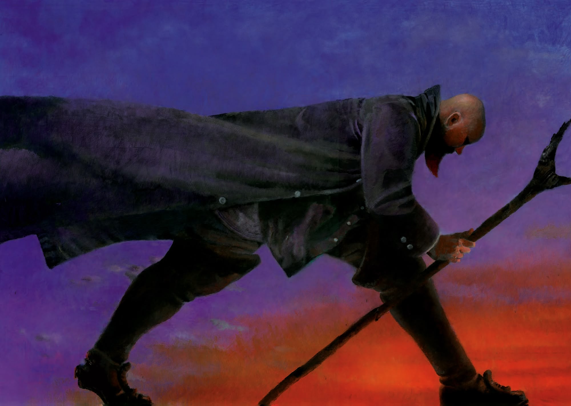
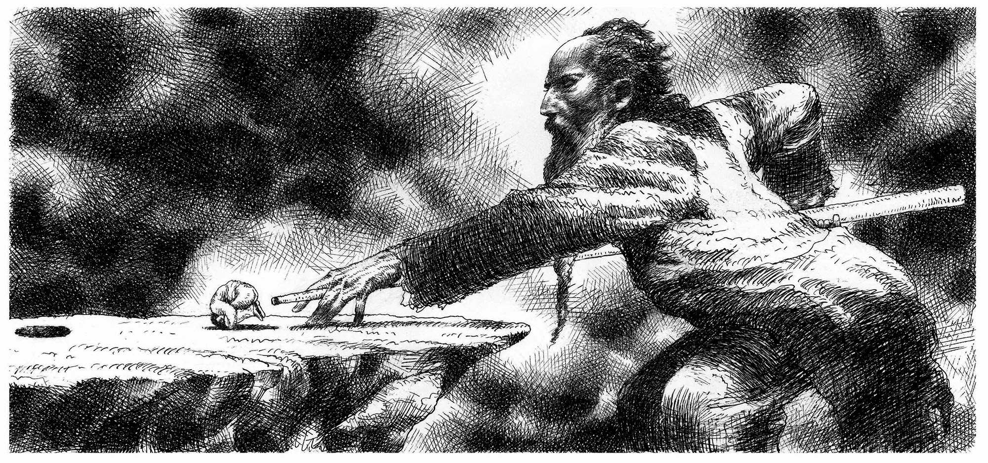
Inside one year, Holland was made a supervisor, responsible for special projects and accountable to no one but his art director. The novelty of financial stability paired with creative autonomy was gratifying but never diminished the artist’s impulse to create away from the factory. Restlessness turned to revelation one sleet-soaked winter evening. Working on a large acrylic painting, Holland suddenly became consumed with an idea: a black and white drawing of a burly, peg-legged sea captain, ankle chained to an anchor and harpoon cast downwards, amidst a patch of Queen Anne’s Lace. Captain Ahab had found himself stranded in Missouri, as it were. Abandoning his canvas for a half sheet of heavily gessoed watercolor board, he completed the drawing overnight, all linework with no halftones. Something of a self-portrait—Holland landlocked and soul stunted—the drawing spawned fifty more like it over the following year; an executioner relegated to a wheelchair, a blind man on silts, and figures with electrical cords extending from their backs were among the concepts transferred from his subconscious to paper. As if finally unfurling beyond his chrysalis form, it was Holland’s fealty to his newfound practice that prepared him for the third and final flight of his life: his destination, New York City. Now 23-years old with a fair portfolio thanks to Hallmark and his nocturnal art practice, the artist caught a midnight bus for the East, convinced that while he might not be able to sell his pictures to art directors, surely, they would sell themselves.
It was the “Summer of Love”—August 1967—when Holland stepped into throngs of sultry New Yorkers on Park Avenue. Not four hours in the city, with his belongings stashed in a locker at Grand Central Terminal, he called on famed graphic designer Herb Lubalin [he found his address in the five-borough phone book]. Whether by pluck or portfolio, the illustrator gained a spot in the premiere issue of Lubalin’s new publication, Avant Garde, setting off a cascade of opportunity: book covers for Doubleday competed with editorial assignments for Holland’s energies as he moved from one fleabag hotel room to the next. The artist's formal repertoire was quickly expanding, his typical use of a #7 watercolor brush and acrylic paint enhanced by the incorporation of monoprint, frisket, and resist techniques.
Holland’s growing portfolio—a mixture of assignments and personal drawings as unconsciously realised as his Captain Ahab—emboldened the artist to pursue Playboy, the highest paying magazine in the business. Travelling to their Chicago offices from New York in December 1967, the artist’s visit with founding art director Art Paul yielded a trial assignment—a double-page spread for an article by P.G. Wodehouse—as well as an opportunity to ratify his artistic sensibility: he would not suffer handlers of his imagery, especially by art department committee as was custom at the magazine. Paul acquiesced and, when Holland’s illustration proved successful, he proffered a monthly feature entitled, “Ribald Classics”. The series of dirty fairy tales, authored by famous contemporary writers like Kurt Vonnegut, Saul Bellow, and John Updike, gave the artist a high-profile platform to experiment with turning subconscious thoughts into pictures that suited a story without originating from it. Undoubtedly, it was Paul’s particularly thoughtful art direction—his recognition of artistic integrity in illustrators a corollary of his insistence on his own as an art director—that taught Holland to finally take firm grasp of his intuition and solidify his metric. The two would form a dear and productive friendship over the 20 years that “Ribald Classics” ran, the lasting effects evidenced by Holland’s expedited rise to fame.
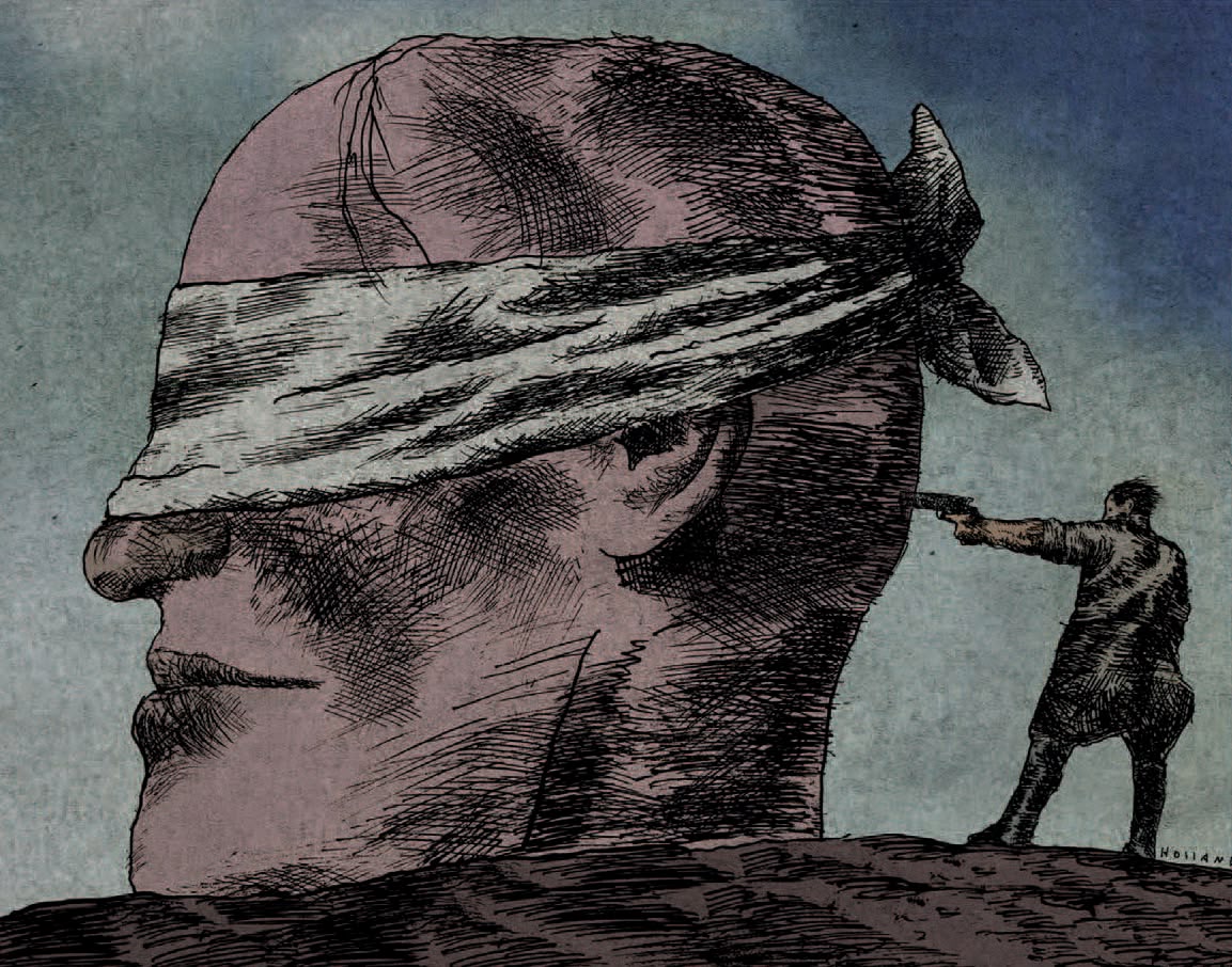
Convincing editors in New York to accept subliminally derived editorial illustrations was a hard-won negotiation for Holland, their traditional conditioning stubbornly resistant to the dream-like logic of his psychic landscapes and surreal personages. Circumnavigating this barrier, the artist took advantage of the flexible forum that New York’s counterculture press provided, often contributing to The New York Review of Sex and Politics among others. His inky, phantasmagorical creatures soon attracted the attention of Jean-Claude Suares, a brash young New York Times art director deputized to establish a graphic personality for the newspaper’s new Op-Ed page, premiering September 21, 1970. Focusing on illustrators influenced not by the political cartoonists of the past but rather fine art movements like Surrealism and Dada, Suarez invited Holland to meet legendary editor Harrison Salisbury, who in turn offered the artist a two-page assignment on welfare reform. The conceptual strength, shrewd linearity, and bruyant hatching comprising Holland’s illustrations were unprecedented at the Times, a harbinger of the second peak of his career. The Op-Ed page would consistently feature the illustrator’s provocative imagery, reaching particular notoriety during the summer of 1973. Representing the concurrent Watergate hearings, Holland gave dramatic form to essential preposterous ideas: in one drawing, President Richard Nixon sits on the shoulders of his toppling chain-of-command; in another, informally named “Trickle Down”, the artist makes oblique reference to the President’s corrupt economic policies. These illustrations would make repeat impact, later appearing on the cover of the exhibition catalogue for “The Art of the Times” [Universe Books, 1973], a presentation of the Times Op-Ed artwork that toured between the Musée des Beaux Arts, Bordeaux, and Paris’s Musée des Arts Décoratifs in 1973 and 1974, respectively. In the years that followed, Holland would play a key role in the widespread adoption of an editorial premise based on treating graphic art and the written word as equal, independent companions on the printed page.
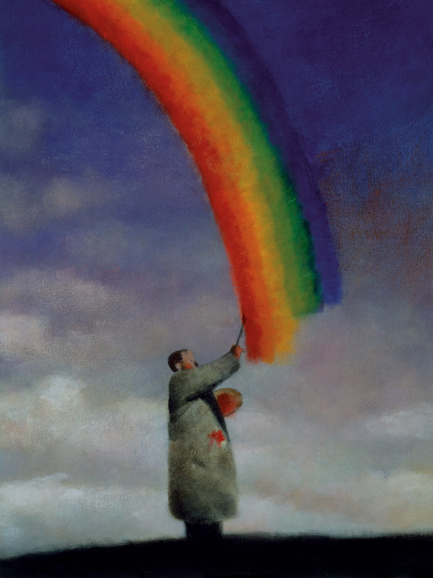
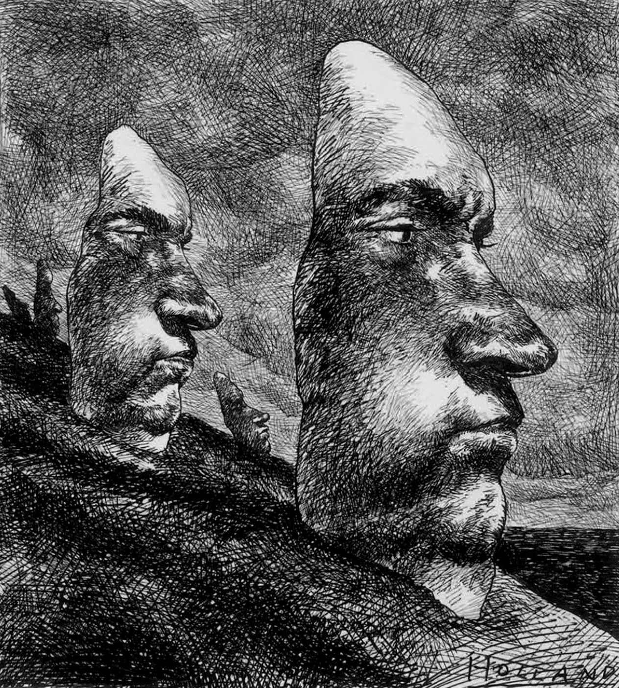
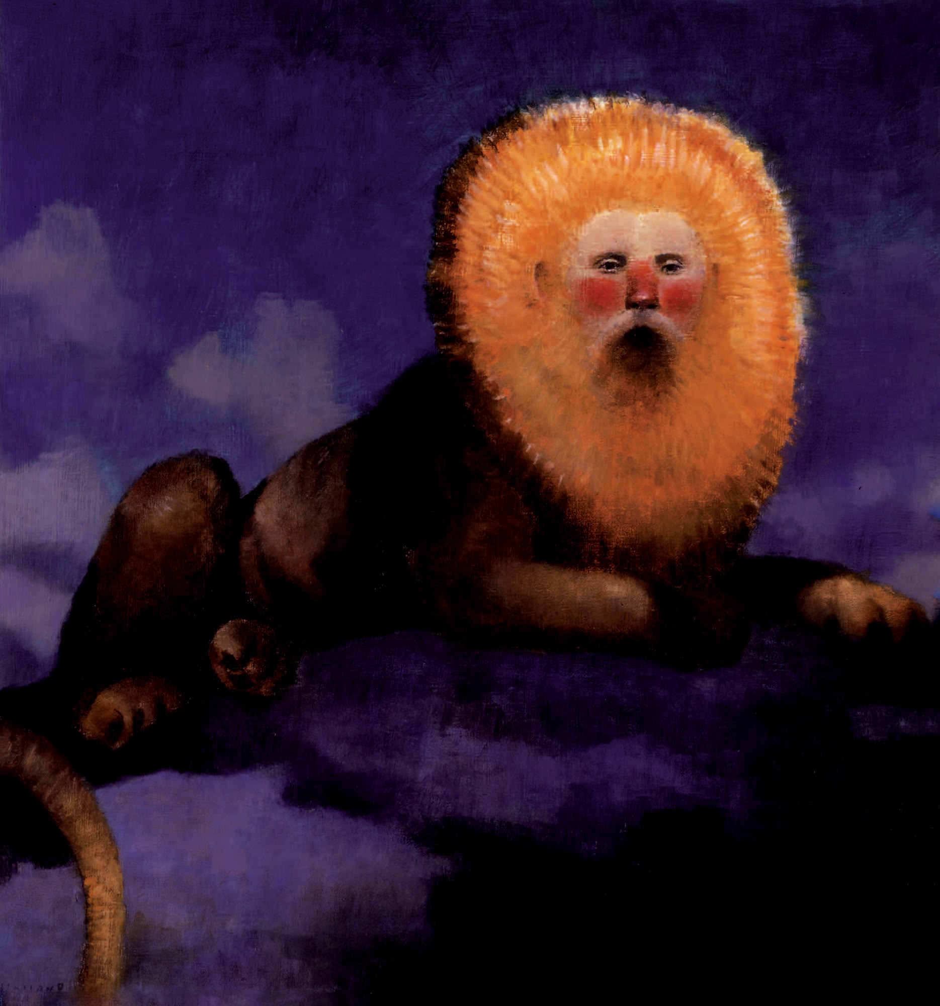
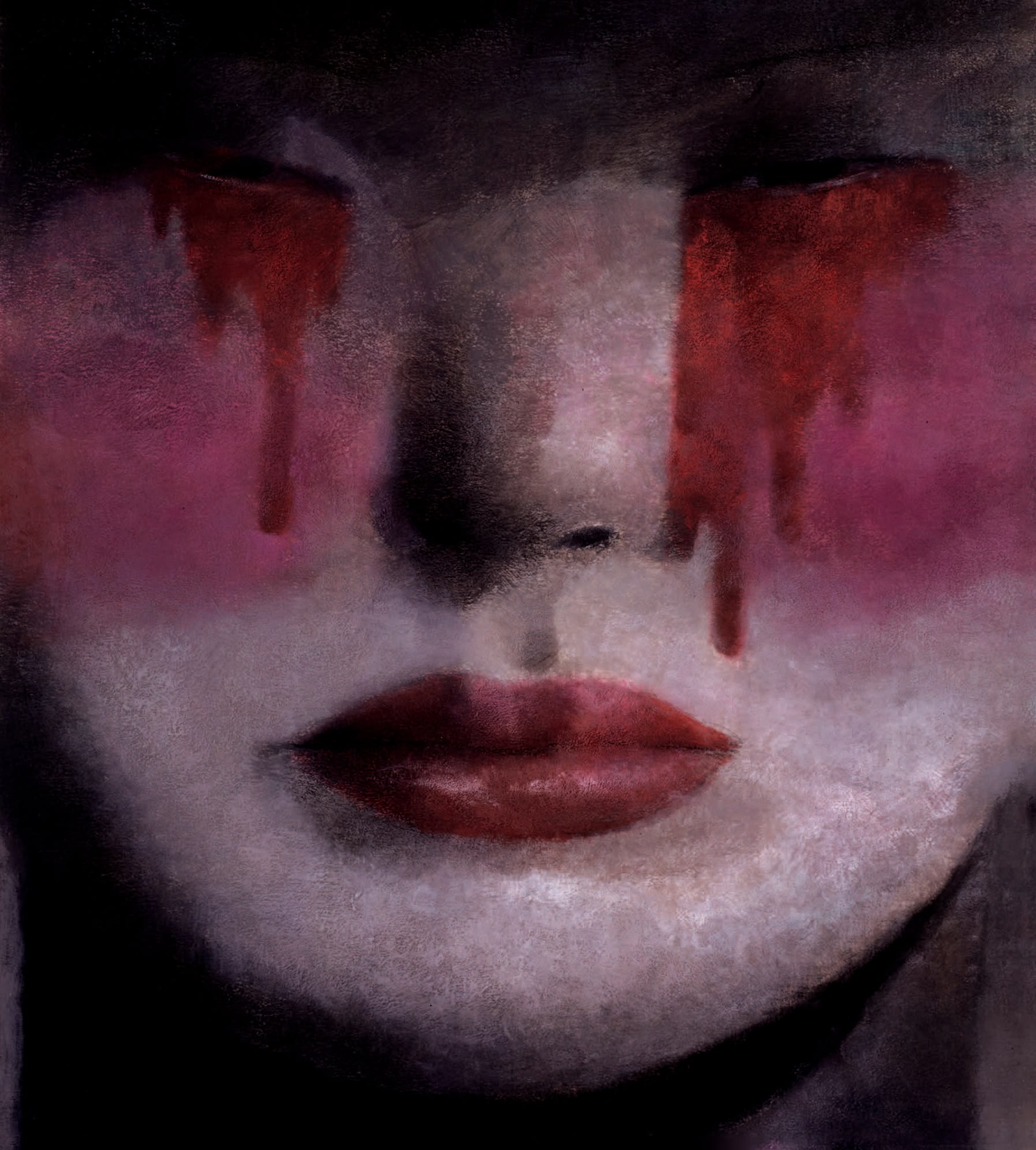
Few artists are as capacious as Bradford Holland, the canals of his mind still encrusted with the magic of unfathomable ideas to this day. An eccentric cast of oversized babies, teeth-baring oysters, and men puppeteering clouds in his wake, the artist recently lent his virtuosic dissolution of color and texture into form to the artwork for author Jonah Winter’s “It Happened in Salem” [Creative Editions, 2024] and his paintings will be further celebrated at the forthcoming presentation of “Such Stuff as Dreams”, a book and exhibition produced by Milan’s Galleria Nuages. The creative footprint of Holland’s innovations is as undeniable as it is indelible—now ubiquitous, the landscape of “conceptual illustration” is a credit to his indomitable courage in the upstream current of his industry. The recipient of numerous awards, including 25 gold medals from the Society of Illustrators and a place in their Illustrators Hall of Fame [2005], the artist’s oeuvre has been honored by two anthologies of drawings, “Human Scandals” [Crowell, 1977] and “Géant endormi” [Cadessines, 2021], published only in French. These books not only record Holland’s ability to collapse the modalities of fine art and illustration into a single, truthful mode of expression, but also appeal to the forgotten corners of our subconscious to eerie but pleasing effect. It's not necessary to recognize his conscious or unconscious allusions to enjoy the special flavor of Holland’s work. That said, decoding any of his references can simultaneously confer a sense of having solved a Magic Eye and an awareness of how much else you are undoubtedly missing.